Talking discrimination & maps with kids in the classroom
Most kids love maps.
They provide a huge amount of information in one place, often in beautifully illustrated and colourful formats. They can be pored over for hours, dissected in classrooms and eventually hung on walls to observe for a lifetime. Some kids never grow out of their love for maps.
But maps can also be problematic tools. Anything which implicitly or explicitly claims to represent reality should always be questioned, and this is particularly true for maps. Maps have been historically used as colonial tools and represent great violence and silencing for some communities. While many teachers already address these issues in classroom, we’ve compiled a few additional resources.
Here are a few ways to use maps to help kids think about maps and discrimination, as well as how maps can both reinforce and disrupt existing systems of knowledge.
There are plenty of different ways to think about maps and discrimination… these are just a few simple ways that teachers can discuss how maps can create and reinforce inequalities.
Show them upside down maps
Upside down maps are a lot of fun. Some kids will never have seen a map deliberately designed to be upside down. It can be a bit unnerving, even for adults. But upside-down maps are more than just an oddity. The concept of a North-South map was created by European cartographers, who conformed to the idea that Europe was superior, and therefore higher up, than the rest of the world.
In 1979 Stuart MacArthur created the Universal Corrective Map of the World, with the North-South axis flipped (although it’s important to note that MacArthur was Australian, so not necessarily presenting a significant challenge to Western hegemony).
You could even try showing an upside-down map to a group of kids without initial explanation, then question their assumptions as a learning methodology. If children claim the map isn’t “right” gently challenge their assumptions about what right is and explain that there’s nothing ‘right’ about north being at the top. You can also challenge them to think about whether they assume that things at the top are more important the those at the bottom, and whether that translates to the map or not.
“If children claim the map isn’t “right” gently challenge their assumptions about what right is and explain that there’s nothing ‘right’ about north being at the top”
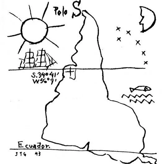
You could also look at some other maps which represent smaller regions as upside down, to really drive home the point. You’ll probably be able to find an upside-down map of your own country. A simple and beautiful example of this is América Invertida by Joaquín Torres García.
Talk about Peters vs. Mercator projections
Making maps is hard.
Trying to accurately draw a sphere onto a square piece of paper is basically impossible, so people have come up with different ways of doing it, with various unintended results.
A great way to demonstrate that to kids is cutting up an inflatable globe and trying to flatten it (here’s a video showing it if you don’t want to fiddle about with an inflatable globe!).
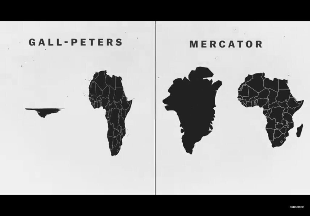
The Mercator map was invented in 1569 as a navigational tool. It prioritizes straight lines and directional bearings to make navigation clear. But the awkward result is that it messes about with the relational sizes of continents and countries, making some seem larger and some seem smaller.
Results include:
Making Alaska look roughly the same size as the continental US, although it’s actually much smaller
Greenland and Africa seem the same time on Mercator, but Africa is 14x larger.
Antarctica looks MASSIVE, but it’s the second smallest continent.
Here’s an excellent demonstration of how the Mercator map disfigures relational size.
Unfortunately, the Mercator map runs into the same problem as traditional North-South maps – it implicitly reinforces ideas that Europe and North America are more important than the rest of the world. The sizes of Africa and Latin America are significantly smaller than reality, while Europe and North America seem massive.
It’s crucial that kids who are using Mercator projections understand the limits of the map and try their hardest to be aware of the bias that creates.
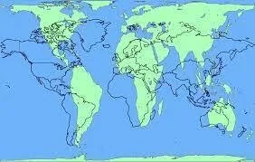
The Gall-Peters projection provided an alternative to Mercator and shows all the continents at their relative size. However, it has also been criticized for distorting the shapes of continents, despite preserving their size and therefore is just as distorted as Mercator. Other people just think it’s ugly.
“Children don’t have to choose which map is the best – we can all use multiple different maps for different purposes. ”
Many people prefer instead to use other projections like the Winkel III projection which does away with the idea of a square map completely.
There are many angry debates over which map is better, which is more accurate, even which is the most aesthetically pleasing. We recommend looking at all the maps with children, allowing them to think about the benefits and disadvantages of all the maps. They don’t have to choose which map is the best – we can all use multiple different maps for different purposes.
As Borges said, “the map is not the territory”. All maps are partly made up.
“The map is not the territory”
Indigenous maps
It’s hard to avoid that fact that map-making is a mostly colonial practice and that maps have reinforced colonial beliefs and policies for centuries. Showing children alternative maps of territories they already know is a way to challenge some of these beliefs. There are two ways to do this.
o Alternative maps
Settler lands like Canada, the USA and Australia predominantly use maps which promote their own cultures, drawn onto previously blank maps which wipe out any pre-colonial borders and names. Showing re-drawn maps – either historical or modern – can be a powerful way of reinterpreting the history and ownership of the land.
AIATSIS has a fantastic map of Aboriginal and Torres Strait Islander nations, showing the diversity of Aboriginal cultures and peoples, as well as challenging the ‘modern’ map of Australia. This map also provides a fantastic opportunity to explore broader mapping issues on this continent, including songlines, celestial navigation and traditional wayfinding.
It’s also possible to find maps of North America which ignore modern landmarks, instead focusing on traditional tribal lands.
o Challenging the conventions of a map
It’s also important for kids to understand that a ‘map’ doesn’t have to conform to the standards of an Ordnance Survey composition. A broader definition of a map is ‘a visual representation of an entire area or a part of an area, typically represented on a flat surface. The work of a map is to illustrate specific and detailed features of a particular area’, but this area doesn’t necessarily need to be topographical.
“Indigenous peoples provide fascinating and beautiful examples of maps which challenge Cartesian accuracy but represent different truths”
Indigenous peoples provide fascinating and beautiful examples of maps which challenge Cartesian accuracy but represent different truths. These maps focus on other factors than compass directions or longitude and latitude, instead using stars, stories, peoples, sensations and more to determine direction.
These maps can be incredibly geographically accurate, such as the map drawn by Tupaia, Cook’s Polynesian navigator and guide. They can also help us understand the concepts and stories which were important in indigenous cultures, as with the Cempoala Map from 16th century Mexico. Maps don’t necessarily have to be scientifically accurate to be used as navigational tools.
Here’s an interesting article about counter-mapping, the practice of deliberately challenging established understandings of land and people.
Renaming in the mapping process
One way in which the practice of map-making has been damaging is through re-naming. Colonial forces who were tasked with mapping areas often gave new names to places (see Brian Friel’s Translations for an excellent fictional re-telling).
This re-naming was a form of control and separating local peoples from their language and their land. Several high-profile places have reverted to their own names in recent years, but in many other countries the original names are now lost.
This practice is very clear in Ireland, where many traditional names were lost to English colonialism and even street names were given the names of English heroes.
It’s important the children appreciate the role of names on the maps they observe. The maps they look at will probably have the English versions of names, rather than in their native tongues (e.g. The Netherlands, rather than Nederland). Beyond that, many places will still have their colonial names, imprinted on maps even if it’s not the local or original name.
Open up a discussion about whether and how this should be addressed with kids – including why the names we give to things can be so important.
You can also talk about how just because something is written on a map, it doesn’t necessarily mean that it’s true. Reality is always more complicated than a map.
If only maps were simple right?
While maps can be complex narratives involving history, culture, geography, colonialism, discrimination, inequality, resistance and more, they’re also an opportunity for kids to think critically in the classroom, as demonstrated in the maps above.
Maps are a tool to understand the world, just like books, films, TV and lessons, but they can always be questioned and challenged. Kids are capable of asking themselves, from a young age, a series of critical questions about maps. Things like, what information is a map trying to tell you? Who made the map? Is there a different map of the same thing?
Plenty of adults could do with asking those questions too.
At Deliberate Travel Kids…
we spend a lot of time thinking about how to integrate critical thinking and anti-colonial thinking into our educational materials.
We make educational workbooks for kids aged 6-12 centred on research activities and educational puzzles. Each workbook is based on a different country, and we look at the history, culture, geography, stories, peoples and animals of that place.
We want to push past the basics and stereotypes which often get used in kids’ educational materials, while combining good design and strong learning design principles to make our workbooks both fun and unexpected.
Our goal is to spark kids’ curiosity in learning more about the world and to guide them into respect and interest in all the countries of the world.


